Daftar Blog Saya

Minggu, 26 Maret 2006

The Stubborn Italian

About a week ago, I got an email from an Italian named Giacomo Polonijo asking for translation help. He wanted to get a tattoo of three words “Consciousness, Coherence, Balance” and hoping I could verify the translation for him.

Two days later, he sent me the design he is planning to use.


I was horrified by the poor penmanship as well as the missing partials in the characters; I informed him that whoever designed his tattoo probably only had primary school education in Chinese or Japanese.

To illustrate my point, I attached the correct characters (written in red) back to him for comparison.

In an immediate follow-up email, I strongly urge him not to get the characters tattooed.

Unfortunately, I have the feeling that he is too stubborn to take my advice seriously.

C’est la vie.


T-shirts Giveaway sponsored by Hanzismatter and Jlist.com

Ease of Gas Retention

From Brazil, reader Joao (a long time Japanese student) sent in a photo of this young man proudly displaying his cool tattoo at a party.


Besides the fact the characters are poorly written, the true meaning of the tattoo may not be as what the owner intended.
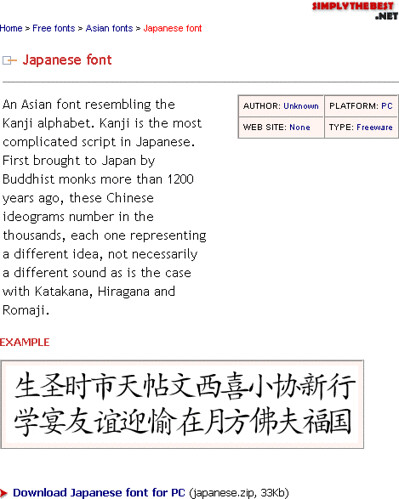
(air, gas, steam, vapor; spirit), (stop, halt, desist; detain), (peaceful, quiet; happy, healthy), could be interpreted as “ease of gas retention”.

Perhaps this is some kind of viral ad campaign by makers of gas-relief medications?


T-shirts Giveaway sponsored by Hanzismatter and Jlist.com

Selasa, 14 Maret 2006

Downloadable Gibberish Asian Fonts

Patrick emailed me this fantastic find from Simplythebest.net.
It is a free downloadable “Japanese Font”.


asian font
(screen capture)

Notice the inconsistency of whether it is “Japanese” or “Asian” font between its title and first sentence in the description?

Anyone who has the very basic knowledge of Chinese or Japanese language would know there is no such thing as “Kanji alphabet”.

Plus, the font table is nothing but a bunch of random simplified Chinese characters. Not to be confused with the "example" shown above, font table looks like this.

Even though this is not the same font used in Marquis Daniels or that Finnish racist’s tattoo, it may explain why and how incorrect tattoos are generated with.


T-shirts Giveaway sponsored by Hanzismatter and Jlist.com

New York Times and Tattoo Choices

Ringkasan ini tidak tersedia. Harap klik di sini untuk melihat postingan.

Jumat, 10 Maret 2006

"Skin, Hair, Body"


http://www.bmezine.com/tattoo/A60307/high/bmepb236775.jpg

This tattoo
was shown in March 7th of BMEzine’s kanji gallery without any caption.

The first character (leather, skin) and last character (body) are done correctly. I am having trouble on deciding if the owner wanted (capitol of Anhui province) or (hair, milli-) in the center.

As of right now, I think it should be , which means “skin, hair, body”.

In a previous post, owner of a claims she was told it meant “carpe diem”, which is wrong.


T-shirts Giveaway sponsored by Hanzismatter and Jlist.com

Interviews and Comics

Ringkasan ini tidak tersedia. Harap klik di sini untuk melihat postingan.